Using Matplotlib
Introduction
Matplotlib is a plotting library for the Python programming language and its numerical mathematics extension NumPy. It provides an object-oriented API for embedding plots into applications using general-purpose GUI toolkits like Tkinter, wxPython, Qt, or GTK. In this tutorial, we will cover the basics of using Matplotlib for data visualization.
Installation
To install Matplotlib, you can use pip:
pip install matplotlib
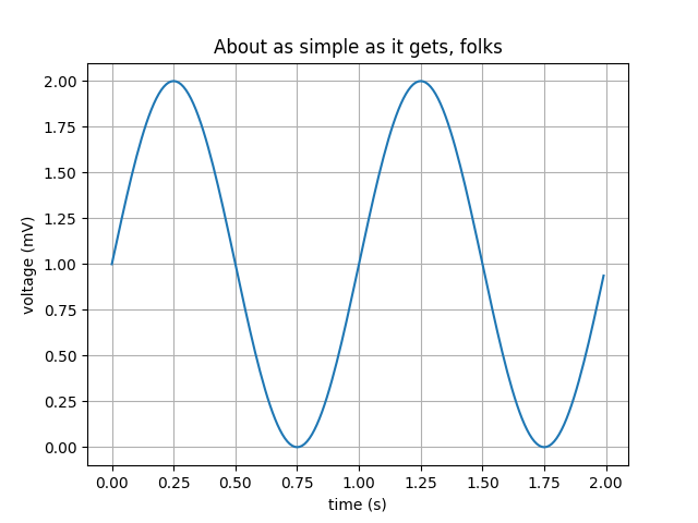
Basic Plot
Let's start with a simple line plot. You need to import the pyplot module from Matplotlib and use the plot() function:
import matplotlib.pyplot as plt

plt.plot([1, 2, 3, 4])
plt.ylabel('some numbers')
plt.show()
Formatting the Plot
You can format your plot by adding titles, labels, and customizing the appearance of the lines and markers:
plt.plot([1, 2, 3, 4], [1, 4, 9, 16], 'ro')
plt.axis([0, 6, 0, 20])
plt.title('Simple Plot')
plt.xlabel('x-axis')
plt.ylabel('y-axis')
plt.show()

Plotting Multiple Lines
You can plot multiple lines by calling the plot() function multiple times before calling show():
t = [0, 1, 2, 3]
plt.plot(t, [0, 1, 2, 3], 'r--', t, [0, 1, 4, 9], 'bs', t, [0, 1, 8, 27], 'g^')
plt.show()

Subplots
Matplotlib allows you to create multiple plots in a single figure using the subplot() function:
import numpy as np

x = np.arange(0., 5., 0.2)
plt.subplot(221)
plt.plot(x, x, 'r--')
plt.subplot(222)
plt.plot(x, x**2, 'bs')
plt.subplot(223)
plt.plot(x, x**3, 'g^')
plt.subplot(224)
plt.plot(x, np.sqrt(x), 'mo')
plt.show()

Bar Charts
Bar charts can be created using the bar() function. Here's an example:
labels = ['G1', 'G2', 'G3', 'G4', 'G5']
men_means = [20, 35, 30, 35, 27]

plt.bar(labels, men_means, align='center', alpha=0.5)
plt.xlabel('Groups')
plt.ylabel('Scores')
plt.title('Scores by group and gender')
plt.show()

Histograms
Histograms can be created using the hist() function. Here's an example:
data = np.random.randn(1000)

plt.hist(data, bins=30, alpha=0.75, color='blue')
plt.title('Histogram of normally distributed data')
plt.xlabel('Value')
plt.ylabel('Frequency')
plt.show()

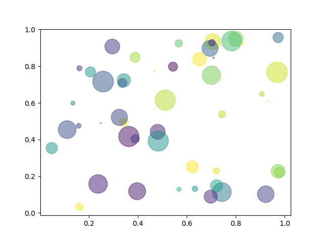
Scatter Plots
Scatter plots can be created using the scatter() function. Here's an example:
x = np.random.randn(1000)
y = np.random.randn(1000)

plt.scatter(x, y, alpha=0.5, c='red')
plt.title('Scatter plot of random data')
plt.xlabel('x')
plt.ylabel('y')
plt.show()
Conclusion
In this tutorial, we have covered the basics of using Matplotlib for data visualization. We started with simple line plots and moved on to more complex plots such as bar charts, histograms, and scatter plots. Matplotlib is a powerful tool for creating a wide variety of plots and customizing them to suit your needs. Explore the Matplotlib documentation for more advanced features and customization options.